This is the third post in a series on optimising mobile websites for conversions. The previous two posts covered Content Prioritisation and White Space.
In Summary: Buttons rule on mobile devices. The rule of thumb means that big, well spaced buttons with clear calls to action will likely result in more conversions.
Before looking at how buttons can make the mobile user experience better we must first understand the way mobile users navigate. Think about the way you hold your phone. More often than not it’s in just one hand and because your fingers are gripping the phone from behind, you are left only with your thumb for navigation of the screen. The thumb is far less precise than a mouse pointer.
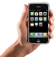 |
| As you can see from this image, fingers are behind the phone leaving the thumb to do all the work |
The Mobile Rule of Thumb: If it cannot be done with the thumb, it cannot be done.
The hyperlink is a poor user experience on a touchscreen mobile device because it is very hard to use with an imprecise instrument like the human thumb. If that’s not all, mobile devices are often used by people on the move, so hitting a small point on the screen is just getting harder and harder. The best way to alleviate these issues is to build your links into big buttons which allow for greater levels of inaccuracy.
Here are are a few things to consider when building button links:
Buttons Should be Big
In a recent study of iPad users, Jakob Nielsen, the father of human computer interaction studies, recommends that buttons be at least 1cm x 1cm in diameter. That’s 28px assuming the standard web resolution of 72dpi. There’s a lot of debate around this area.
Apple is recommending 44x44 at a minimum for buttons in apps.
A very interesting introduction to designing for different screen sizes on Android can be found here.
This is something you really need to test when building your site. Without a mouse or even a stylus, buttons need to be big. Put simply, you should build buttons for thumbs. And err towards large thumbs. There is also the issue of light. Many mobile screens perform poorly in daylight or bright light environments – big buttons make it easier to perform tasks while visibility is low.
Buttons Should be Isolated
How many times have you tried to click a button on a mobile device only to find that you have inadvertently clicked something else? It can be a really painful experience and is also a sure-fire way of making a user give up in frustration and go somewhere else. One way to avoid accidental clicks is to ensure that buttons have a little space between them. Call-to-action buttons especially should be isolated. Where possible, leave a little white space around buttons.
Buttons Should be Reachable
The placement of your buttons is also important. Just as we need to consider big thumbs for button size, we need to think about what is comfortable for thumbs when placing buttons. The standard navigation button is across the whole page on mobile sites so it isn’t really an issue but many mobile sites have call-to-action buttons which are shorter and sit on one side of the screen or the other. If possible, these buttons should be made longer and centred more. Not only does that make them larger but it’s easier for both left and right handed people to reach the buttons with their thumb. If you must choose a side of the screen, contrary to the right side placement often found on desktop, it is actually more comfortable for a right-handed thumb (the majority of users) to click a button on the left side of the screen.
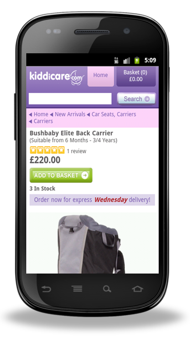 |
| Kiddicare found button placement on the left side of the screen was easier for users than the right |
Smaller Buttons Should be Padded
Padding refers to making clickable an area larger than the button itself. This can be especially useful for check boxes or buttons that need to be smaller so as not to draw attention away from the main call-to action. The trick is to make the area immediately around the button clickable as well. In the case of check boxes, it is important to leave sufficient space between boxes and then to make the text next to the box clickable too.
Buttons Should Look Like Buttons
This might seem like common sense but it is not unusual to find links on mobile sites which behave like buttons but do not look like them. Whether it is a link that looks the same as the text around it or a button that looks like a heading, the user needs some form of visual cue to help them understand where to click. Make buttons look three dimensional and they are more likely to invite clicks. It is also important that your site clearly indicates to a user which button they have clicked. Some sites do this really well, but others are a little patchy. Touching any part of a button should result in a visual signal for the user.
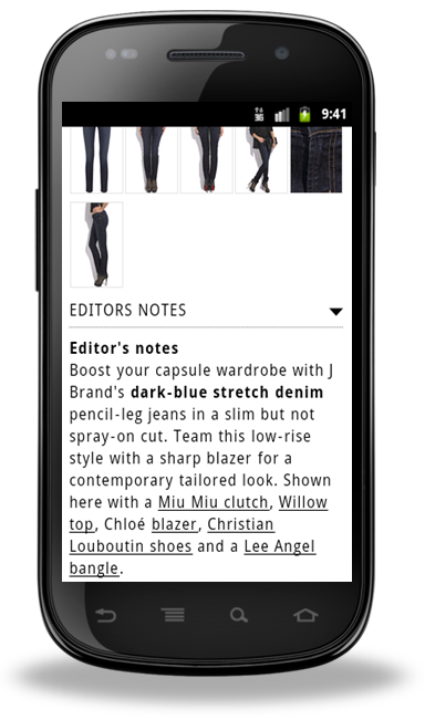 |
| Why use buttons? Imagine the difficulty of picking the right link in the example above. |
So does this mean we can never use hyperlinks? Of course you can. But you should use them minimally and don’t put lots of them into the same space. As a rule, try to have no more than one link per band of text. For example, In the point above about making buttons big enough, I have spread the points with links across multiple lines to make it easier for touchscreen users to tap them on the mobile version of this blog.
Of course when it comes to a mobile site which is trying to convert visitors into customers, try not to have much text.
In summary, buttons on mobile sites should be:
- Big
- Isolated
- Reachable
- Padded
- Obvious
- Prioritised
- Descriptive
Mobile Website Testing Tip: When you are building your mobile site, physically test it while you are in motion to best replicate the real-world user experience.
The next post will be looking at how to make conversions easier to complete on a mobile website. If you have feedback, please leave a comment.
Posted by Shane Cassells, Google Conversion Team
Part 3: Mobile website optimisation - 7 considerations when designing buttons on mobile websites
Rating: 100% based on 975 ratings. 91 user reviews.
Rating: 100% based on 975 ratings. 91 user reviews.
Tidak ada komentar:
Posting Komentar